As noted in the methodology for each, there's a small amount of fuzziness in some of the numbers for a couple of reasons, the main one being that the "as of" date varies depending on the type of coverage--Medicaid/CHIP total numbers are as of last October, while ACA Expansion Medicaid is as of last June; Medicare data is as of September 2024; and ACA exchange QHPs/BHPs are as of January 2025.
As you can imagine, this has been a monumental task; not only did I have to crunch a lot of data to break out the statewide numbers into House district-level estimates, I also had to convert that data into nearly 480 easy-to-read graphics...and then I doubled my workload by going one step further and adding high-res PDF versions for folks to print out in large format for town halls, rallies and #HandsOff protests nationally.
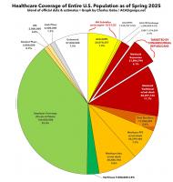
With the pending dire threat to several of these programs (primarily Medicaid & the ACA) from the House Republican Budget Proposal which recently passed, I'm going a step further and am generating pie charts which visualize just how much of every Congressional District's total population is at risk of losing healthcare coverage.
USE THE DROP-DOWN MENU ABOVE TO FIND YOUR STATE & DISTRICT.
As of today, 650,000 North Carolinians have access to affordable health care thanks to Medicaid expansion! When leaders come together across political differences, we can make people’s lives better.
Now we must come together to defend this bipartisan victory from proposed federal cuts. People’s health and our health care system depend on it.
Governor Josh Stein announced that as of today, 650,000 newly eligible North Carolinians have gained access to affordable health care through Medicaid expansion, including veterans and workers in child care, construction, hospitality, home health care and other industries essential to the state.
With the pending dire threat to several of these programs (primarily Medicaid & the ACA) from the House Republican Budget Proposal which recently passed, I'm going a step further and am generating pie charts which visualize just how much of every Congressional District's total population is at risk of losing healthcare coverage.
USE THE DROP-DOWN MENU ABOVE TO FIND YOUR STATE & DISTRICT.