As noted in the methodology for each, there's a small amount of fuzziness in some of the numbers for a couple of reasons, the main one being that the "as of" date varies depending on the type of coverage--Medicaid/CHIP total numbers are as of last October, while ACA Expansion Medicaid is as of last June; Medicare data is as of September 2024; and ACA exchange QHPs/BHPs are as of January 2025.
As you can imagine, this has been a monumental task; not only did I have to crunch a lot of data to break out the statewide numbers into House district-level estimates, I also had to convert that data into nearly 480 easy-to-read graphics...and then I doubled my workload by going one step further and adding high-res PDF versions for folks to print out in large format for town halls, rallies and #HandsOff protests nationally.
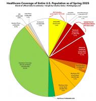
With the pending dire threat to several of these programs (primarily Medicaid & the ACA) from the House Republican Budget Proposal which recently passed, I'm going a step further and am generating pie charts which visualize just how much of every Congressional District's total population is at risk of losing healthcare coverage.
USE THE DROP-DOWN MENU ABOVE TO FIND YOUR STATE & DISTRICT.