

Pie Charts Galore! Medicaid! CHIP, ACA & Medicare enrollment by Congressional District
Wed, 02/26/2025 - 5:33pm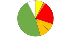
NOTE: This is a work in progress. Check back soon as I'm adding more states every day.
Over the past couple of months I've compiled a master spreadsheet breaking out enrollment in ACA plans (Qualified Health Plans & Basic Health Plans), Medicaid/CHIP coverage (both traditional & via ACA expansion) and Medicare (both Fee-for-Services & Advantage) at the Congressional District levels.
As noted in the methodology for each, there's a small amount of fuzziness in some of the numbers for a couple of reasons, the main one being that the "as of" date varies depending on the type of coverage--Medicaid/CHIP total numbers are as of last October, while ACA Expansion Medicaid is as of last June; Medicare data is as of September 2024; and ACA exchange QHPs/BHPs are as of January 2025.
With that in mind, and with the pending dire threat to several of these programs (primarily Medicaid & the ACA) from the House Republican Budget Proposal which passed yesterday, I'm going a step further and am generating pie charts which visualize just how much of every Congressional District's total population is at risk of losing healthcare coverage.
USE THE DROP-DOWN MENU ABOVE TO FIND YOUR STATE & DISTRICT.
The CD-level charts aren't nearly as granular as my national "Psychedelic Donut" version since the more granular data isn't available for many subcategories (besides, there's 436 of them to contend with). In addition, making them to complicated defeats the main purpose of these graphs, which is to be shared as widely as possible to warn people how many of them are at risk.
I've included links to my data sources below (some of these go to my prior blog articles which in turn include direct links to the original data sources & methodology).
Note that it will take some time for me to generate & upload all 436 of these, so please check back soon for updates.
- Total Population from July 2023 estimates via the U.S. Census Dept.
- Percent of total population over 65 from the 2023 American Community Survey (via Census Reporter)
- Uninsured population under 65 from the 2023 American Community Survey (via the Congressional District Dashboard)
- ACA Qualified Health Plan & Basic Health Plan data via the Centers for Medicare & Medicaid Services (CMS)
- Traditional & ACA Expansion Medicaid data via the Centers for Medicare & Medicaid Services (CMS) & various state HHS Depts.
- Children's Health Insurance Program (CHIP) data via the Centers for Medicare & Medicaid Services (CMS)
- Medicare Fee for Service, Advantage & Dual Eligible Data via 2023 House Ways & Means Report to Congress
Advertisement