Dear Reuters & Newsweek: Fixed it for you.

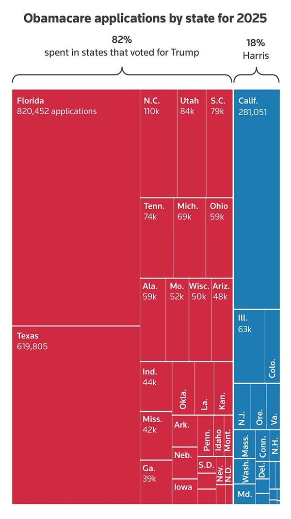
On Christmas Day, as you may recall, a "Treemap" graph which had originally been published 2 weeks earlier in a Reuters article went viral on social media. It was then republished by Newsweek, again without any context provided.
The graph purported to break out "Obamacare applications by state for 2025" by states which voted for Donald Trump vs. those which voted for Kamala Harris in November 2024. Here's what it looked like:
As I noted at the time, this graph was technically accurate...while simultaneously being jaw-droppingly misleading, for several reasons, including:
- It only included people who were either newly enrolled or actively re-enrolled into ACA exchange plans...while ignoring millions of auto-renewed enrollees who had also been reported by the Centers for Medicare & Medicaid Services (CMS).
- It only included data through 11/9 or 11/16 even though more recent data was available at the time it was published.
- The 9 days of data mostly applied to Harris states...while the 16 days of data mostly applied to Trump states, making it a completely absurd comparison
- It didn't include any of the ~1.7M+ Basic Health Plan (BHP) enrollees in New York, Minnesota & Oregon...all three of which voted for Harris
- Most significantly, it didn't include the 20 million Americans enrolled in Medicaid via ACA expansion...which is critical because a significant chunk of those folks in expansion states would otherwise be enrolled in ACA exchange plans if they hadn't done so, while a significant number of exchange enrollees in non-expansion states would otherwise be enrolled in Medicaid if they had done so.
In other words, when making this sort of comparison, you simply can't "disregard" Medicaid expansion.
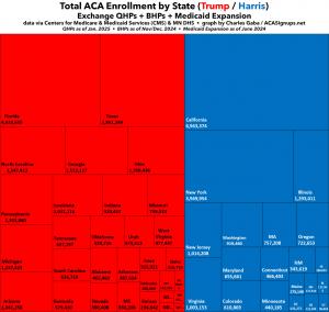
So, now that CMS has published far more up to date & comprehensive ACA enrollment data, what does this "Treemap" graph really look like?
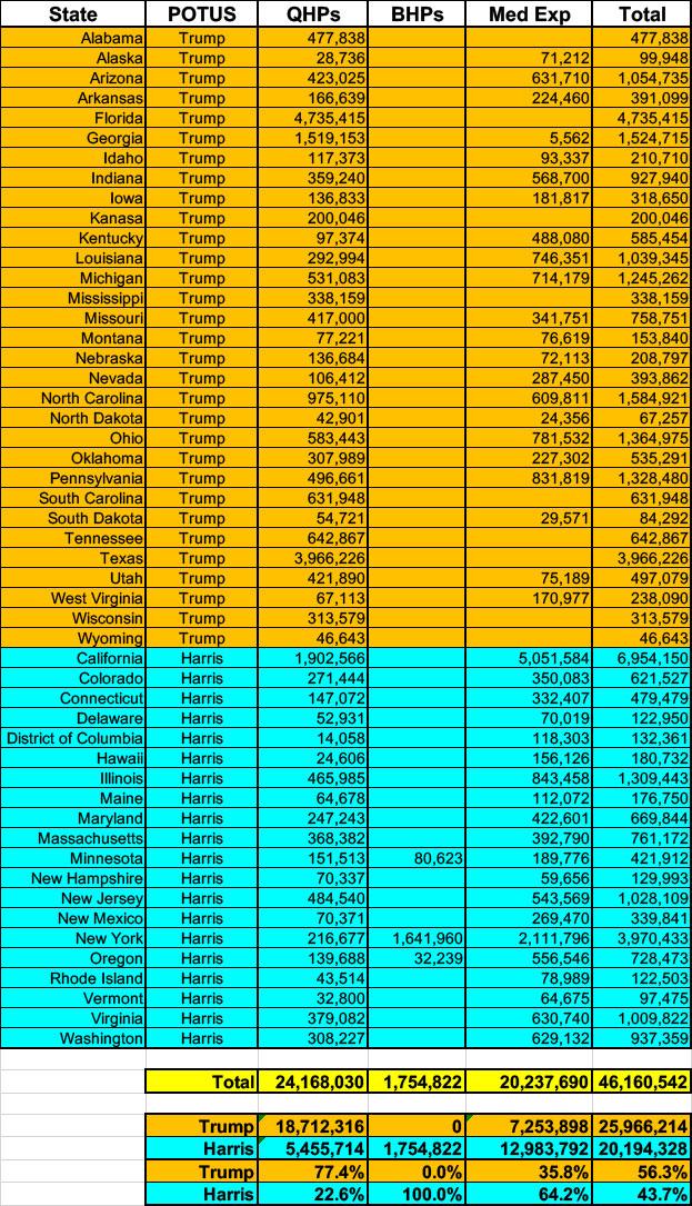
Here you go. Keep in mind that the Medicaid expansion data is about 6 months out of date & has likely dropped off a bit more since June, while the 2025 Open Enrollment Period is still ongoing and will likely add another ~630,000 or so enrollees by the end of January. However, neither of these should shift the relative totals around by much:
UPDATED 1/21/25: With the 2025 Open Enrollment Period completed in nearly every state, I've updated the graph accordingly. It's still around 56% Trump states vs. 44% Harris states when BHPs & Medicaid expansion are included:


