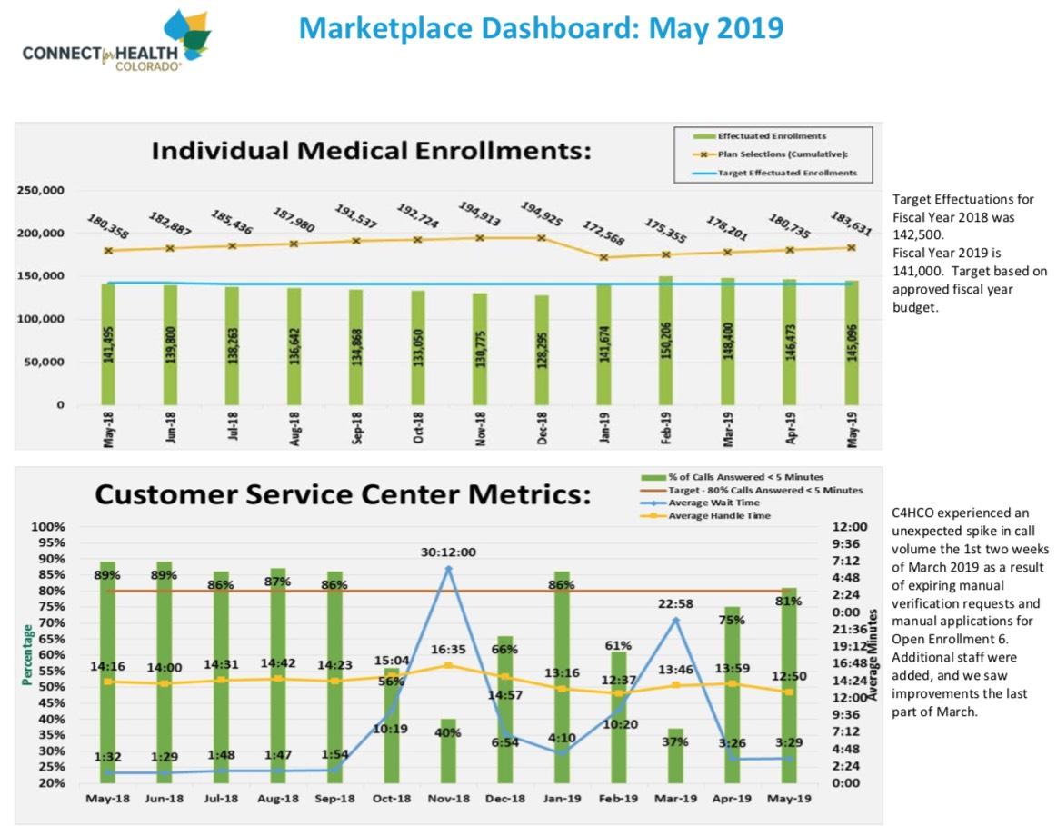
Colorado May Enrollment Report: Running slightly ahead of target
As I noted the other day, some of my blog posts don't have any insight to add, they're purely for aggregating data points. This is one of those posts.
Here's the Connect for Health Colorado May enrollment dashboard report. It doesn't provide much detail, and it's kind of fuzzy/hard to read, but I do like the way it shows both QHP selections (that is, how many people selected exchange policies) as well as effectuated enrollments from month to month.
Remember, around 10% of those who select plans never end up actually paying the first month's premium, and are thus never actually enrolled...and there's some amount of churn after that as people drop their coverage mid-year and new people enroll via Special Enrollment Periods. Then the whole process starts over again the following January.
As a result, you see a gradual divergence between QHP selections increasing and effectuated enrollments decreasing throughout the year...only to reset in January of the next year.


