UPDATE: CMS releases official 2017 Open Enrollment Report!
Moments ago, CMS released the official 2017 Open Enrollment Period final enrollment report. They also released a nice set of bonus data sets at the state, county and even zip code levels, which was unexpected (usually they don't release these until later in the year).
Back in mid-November, I made a Big Deal® about being extremely mistrustful of any official data being released by the federal government after the Trump adminstration took over. I concluded, however, with the following:
In addition, unless I'm mistaken, most of the actual staff...the career employees at CMS/HHS, many of who've been there through more than one administration, will likely remain, and will do their jobs to the best of their ability, including trying to compile and publish data as accurately as possible.
...Given Trump's long, disturbing history of flat-out misstatements (aka "making sh*t up out of whole cloth"), and the type of sycophants he's likely to put into place, I can't guarantee with any certainty that the numbers spouted off by them are going to bear any connection with reality. Maybe they'll be accurate. Maybe they'll be off slightly. Maybe they'll be completely removed from any actual numbers. Who the hell knows?
With this in mind, my initial conclusion is that I don't see anything in this report which raises any red flags. All of the above-the-fold numbers seem to be...pretty much what I was already expecting based on pre-1/20/17 data, as well as the enrollment numbers from the state-based exchanges. Numbers such as the percent of enrollees receiving APTC/CSR seems in line with prior years, and so forth. Conclusion? So far, at least, Tom Price doesn't seem to be monkeying around with the numbers being released.
That being the case, let's dig in!
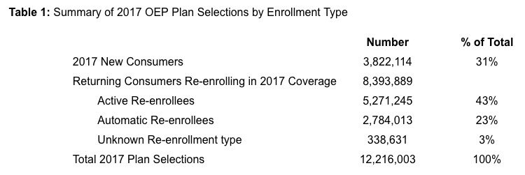
Hmmm...the official QHP Selection total is around 19,000 lower than my estimate (12,235,500). The only states which I thought I was off on are Vermont and Washington State, neither of which had previously provided hard enrollment numbers, but obviously there are some discrepancies here and there. Here's what I had vs. the official numbers:
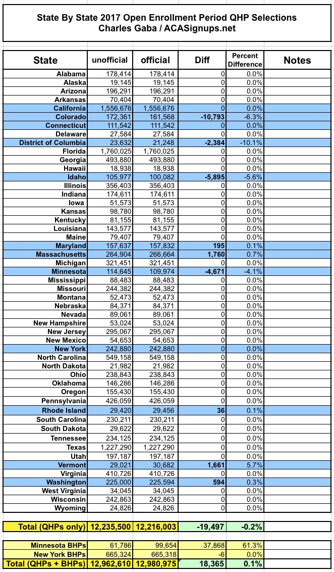
The "missing" enrollments are from Colorado, Idaho, Minnesota and DC, partly cancelled out by higher numbers from Massachusetts and Vermont, with nominal extras from Maryland, Washington State and Rhode Island. The Minnesota discrepancy is because MNsure tacked on an extra week for their SEP; it looks like those enrollments weren't included in the official total. In Idaho's case, I suspect that the 5,900 difference is made up of standalone dental plans (they didn't separate those out in an earlier report). Vermont and Washington are simply due to neither state having released hard numbers earlier.
I'm not sure what accounts for the other differences in CO, DC, MD or RI, but whatever; in the end I was only off by 0.2%, which isn't bad under the circumstances.
Interestingly, when you add in the BHP enrollments from NY & MN, the grand total is actually 18,365 higher than I had thought (+0.1%). I'm not sure how they have MinnesotaCare enrollment over 60% higher than the state's own January 2017 report, but so be it.
OK, what next?
Well, 8.4 million 2016 enrollees ended up renewing/re-enrolling. This is actually very close to what I originally projected back in mid-October (8.5 million), but 700K lower than HHS was expecting (9.2 million). Unfortunately, only 3.8 million new enrollees signed up this year...well below both HHS and my expectations (4.6 million and 5.2 million respectively).
83% of enrollees are receiving APTC (federal tax credits), which is pretty much the same as prior years. Over 7 million people are receiving CSR assistance, which would be wiped out under the Trumpcare plan.
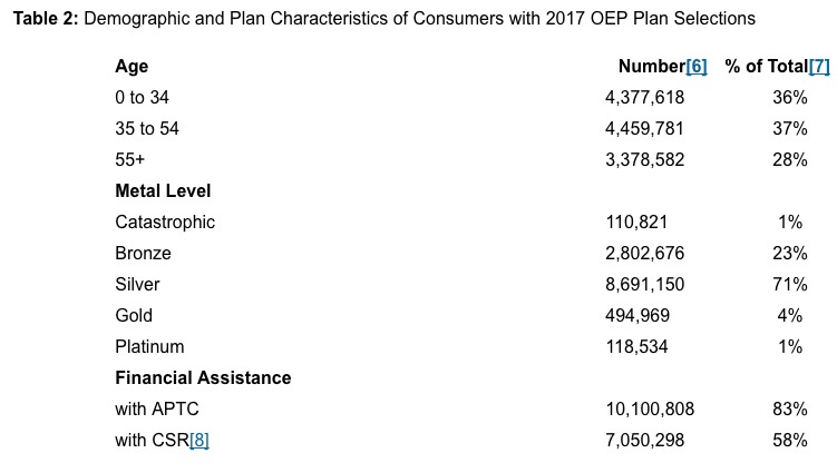
Silver plan selection was higher than last year, which makes sense given premium and deductible increases (not to mention that some carriers dropped Platinum and even Gold plans this year, I believe). Note that the following data only applies to the 39 states on HealthCare.Gov; the 12 state-based exchanges will skew these numbers somewhat:
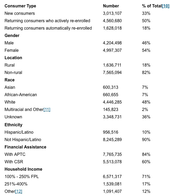
The average APTC assistance being received is $383/month per enrollee for HC.gov enrollees receiving it. Assuming this holds true for the 12 SBMs as well, that's roughly 10.1 million people x $383/month = ~$3.88 billion/month or up to $46.6 billion for the full year. Of course, around 10% of those who select QHPs likely didn't pay/weren't effectuated at all, and assuming the attrition rate throughout the course of the year is similar to the past few years, it'll be somewhat lower than that; probably around a monthly average of perhaps 8.1 million receiving APTC, or $37 billion for the year.
Since only around 4% of enrollees chose either Gold, Platinum or Catastrophic plans this year, looking at the data for Silver and Bronze plans only still gives a pretty accurate view of total exchange enrollments. According to the report, the average unsubsidized exchange policy is running around $489/month, with APTC picking up 78% of the tab on average...for the 10.1 million who receive it at all. This is small comfort to the remaining 2.1 million who have to pay full price, of course, as well as the 6-8 million off-exchange enrollees (exact number unknown) who also pay full price.
Other demographic stuff:
- 3.3 million enrollees are 18-34 years old, or 27% of the total. This is down slightly from the 28% of Young Invincibles that we've seen in past years, likely due to the Trump Administration's last-minute Ad-Kill stunt in the final 5 days of Open Enrollment.
- Assuming enrollment had hit, say, 13.0 million (784,000 higher), around 290,000 of those additional enrollees would likely have been 18-34 (37% of the final surge), bringing the grand total up to around 3.6 million...or 28% out of 13 million. In other words, the same 28% as prior years.
- About 1.5 million people also selected standalone dental plans across the 39 HC.gov states. Assuming a similar ratio on the SBMs, that should be roughly 2.0 million people nationally.
There's a whole mess of other interesting data-nerd stuff available, but right now I have to go into the county and zip code-level data sets so I can update/revise the "How Many Could Lose Coverage" tables/spreadsheets with the latest numbers. Remember, until now the exchange estimates have been partly based on 2016's numbers, roughly adjusted up or down; now that I have the hard 2017 numbers, some of those will change a bit.
UPDATE: Oh, since I spent so much time noting the impact of Trump's "Final Week Ad-Kill" on the final HealthCare.Gov enrollment numbers, I should also update this table, which compares the HC.gov states to the state-based exchange states. It's not quite as dramatic a difference, but there's still a huge disconnect between the two. Again, HC.gov states saw a net drop of either 4.7% or 5.3% (depending on whether you include Louisiana or not, since they expanded Medicaid mid-year)...while enrollment across the 12 state-based exchanges increased by 1.8% year over year. Furthermore, if you include the BHP programs in Minnesota and New York, the SBMs actually saw a whopping 10.6% increase in enrollment year over year!
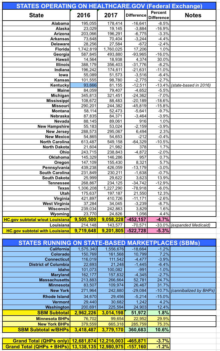
Does this mean that enrollment via HC.gov would have increased by 1.8% if not for the last-minute sabotage efforts? There's no way of knowing that. Even within the state-based exchanges there was a pretty wide range, from tiny Rhode Island dropping 15% to Minnesota jumping by an astounding 31.7% year over year. But if it had, that would have meant an additional 618,000 enrollees if you disregard Louisiana (which, again, I'm inclined to do since their mid-year Medicaid expansion makes it a little unfair to include them here).


