In which one of my garish charts is transformed into a cool-looking NY Times graphic
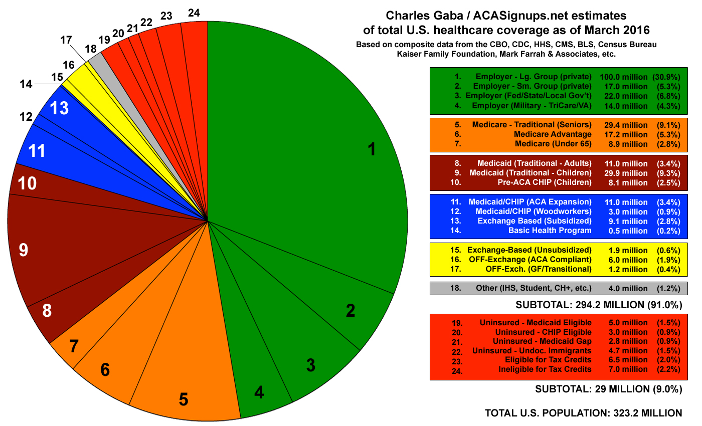
Last March I cobbled together this pie chart, which attempted to break out the health coverage status of every single person living in the United States (yes, including undocumented immigrants). It gained quite a bit of attention at the time from healthcare reporters, wonks and so forth. While my numbers may have been slightly fuzzy here and there, it received a general seal of approval from Larry Levitt of the Kaiser Family Foundation, who stated "Obviously some of the estimates are approximations, but I don't see any glaring problems."

It's important to note that some of the hard numbers and percentages have shifted around slightly since last March. For instance, total Medicaid enrollment has increased from around 71 million last November to roughly 74.4 million today, thanks in large part to Louisiana expanding the program (which has single-handedly added over 300,000 people to the tally), and so on. The methodology for each number/section is available here.
- The green section is Group Coverage/Employer Sponsored Insurance (ESI). It includes Large Group, Small Group, Federal/State/Local Gov’t employees, and even the military (TriCare/VA). This covers around 46% of the country.
- The orange sections are Medicare—traditional (over 65), Medicaid Advantage and Disability (under 65).
- The burgundy sections are NON-ACA Medicaid: Adults, Children and CHIP (remember Hillary’s ‘8 million kids’? They’re here...and it’s actually 8.4 million today)
- Note: There are about 9 million “dual eligible” folks who are enrolled in both Medicare and Medicaid; I’ve included them in the Medicare section only to avoid double-listing them in the chart
- The blue sections are the most obvious areas impacted by the Obamacare: Medicaid/CHIP expansion, the subsidized individual market exchange enrollees, and BHP enrollees in New York & Minnesota.
- The yellow sections are the unsubsidized individual market: Enrolled via the ACA exchange but paying full price, and off-exchange (mostly ACA compliant, with some grandfathered/transitional policies)
- The grey/silver sliver is miscellaneous: the Indian Health Service, Student plans, NY’s ‘Child Health Plus’ program, etc.
- The red sections are those still uninsured. It’s supposedly down to around 27 million people at the moment. This includes…
- A large chunk are ineligible for either exchange policies or Medicaid due to being undocumented immigrants.
- Another chunk are caught in the Medicaid gap in 19 GOP-run states.
- A surprisingly large number are eligible for Medicaid/CHIP...many even without the ACA...but haven’t enrolled yet for various reasons.
- Yet another chunk are people who are eligible for ACA tax credits via the exchange, but haven’t signed up yet. They still have 25 days to do so.
- Finally, there’s a bunch of uninsured people who either earn too much to qualify for ACA subsidies or who are ineligible for subsidies because their employer has a qualifying policy which they haven’t taken.
The point is that, depending on the exact method/process Trump and/or the Congressional GOP takes to repeal the law (partial/total, replacement/no replacement, immediate/delayed, etc), everyone in the blue sections and, potentially, the yellow sections is basically screwed (except for about 3 million in the “woodworker” slice), while those in the green and orange sections are hurt to a lesser (but still significant) extent, since some ACA provisions apply to group coverage, Medicare and so on.
Meanwhile, gutting Medicare impacts the entire orange section, while screwing with Medicaid messes with the burgundy section.
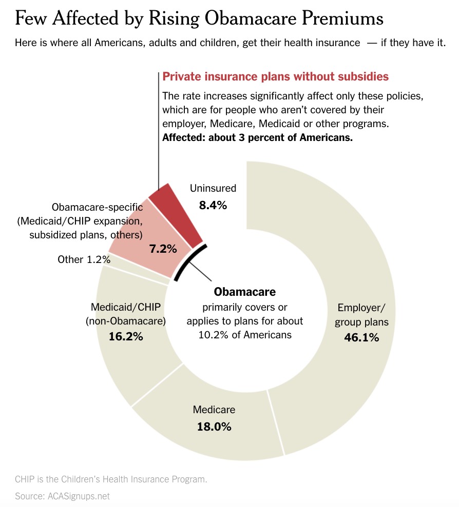
Last month, Steven Rattner and Bill Marsh of the New York Times asked if I'd mind if they utilized the pie chart above in a Year-End Roundup piece that Rattner was writing up. I agreed, and after some back & forth tweaking and modifications to simplify things for the general reader, the Times posted the following a couple of days ago:

It's important to note that some of the hard numbers and percentages have shifted around slightly since last March. For instance, total Medicaid enrollment has increased from around 71 million last November to roughly 74.4 million today, thanks in large part to Louisiana expanding the program (which has single-handedly added over 300,000 people to the tally), and so on.
Obviously our goals were quite different. I was simply trying to slice up all 320 million+ of us into categories to give a general sense of where things stand. Rattner/Marsh are focusing specifically on highlighting (literally) just how many (or how few, depending on your POV) people are actually being impacted by the rate hikes which are the source of so many of the criticisms of the law.
Anyway, I mainly just wanted an excuse to dust off my big ugly pie chart again; given the impending assault on not only the Affordable Care Act but Medicare (privatization/vouchers) and Medicaid (block grants) by the Republican-held Congress as well, I think it's a good idea for people to have a sense of perspective on just how large an impact each one has.


